
Objective
In this study I examine vehicle delay data for the TriMet rail system to answer 3 important questions:
- Which rail lines have the most delays?
- Which rail lines have the longest total delay?
- Which rail stops have the longest total delay?
Background
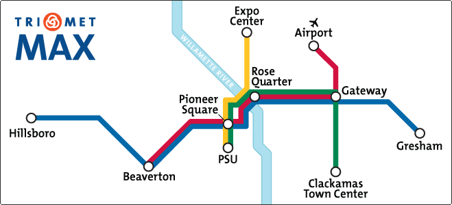
TriMet’s MAX Light Rail system in Portland, OR consists of 5 lines that run east-west or north-south. TriMet collects data from all of its rail vehicles servicing these lines throughout the day, 365 days a year. This data contains information about the vehicle’s location, schedule, and more1. Most importantly, a vehicle’s net delay along its route is reported at every stop. Here I explore 6 months of delay data spanning January 2017 to June 2017. For more information on the original data source, please see TriMet’s developer resource page.
Findings
NOTE: All visualizations are interactive and the data can be accessed through the “edit chart” button on each plot; visualizations were generated using plotly.
1. Which rail lines have the most delays?
Figure 1 shows the number of times vehicles reported a delay by rail line. The blue line had more than triple the number of delays as the red, orange, and yellow lines, and well over double that of the green line. A primary factor of delay count could be the distance covered by a line. This is certainly consistent with the blue line which services from Hillsboro to Gresham, however less obvious with the other lines. Another, possibly correlated factor, is the number of stops each line services.
Figure 1 | Total Number of Delays by Rail Line.

The table below shows the number of stops as well as the number of reports for each line. While the # of stops doesn’t exactly correlate with total delay count, e.g. the red line has the 2nd most stops but the 3rd highest delay count, there is a strong trend. The orange and yellow lines have the least number of stops and also the least number of delays. The red and green lines are in-between in both delay count and number of stops, while the blue line has the most stops and also shows the highest delay count.
The number of reports in the third column can be interpreted as the activity on that line. More reports implies the line had more service stops since schedule updates are reported at every stop. The report count also appears proportional to the delay count.
Table 1 | Number of Stops and Reports Per Rail Line
| Rail Line | Stops (Count) | Reports (Count) |
|---|---|---|
| Blue | 113 | 2442917 |
| Green | 48 | 886290 |
| Red | 65 | 869139 |
| Orange | 26 | 592042 |
| Yellow | 35 | 585471 |
So far we have only looked at the raw number of delays reported by a line. We can divide this number by the total number of reports (on-time, ahead of schedule, or delayed), and multiply by 100 to get a percentage. Figure 2 shows the percentage of time a rail line reported a delay. Interestingly, the blue line has the 2nd lowest percentage. The orange and yellow lines had the lowest total delay counts but are delayed most of the time. Compare the blue line which is delayed 70.2% of the time to the orange line which is delayed 77.6% of the time!
Figure 2 | Percentage of Time a Rail Line Is Delayed.

2. Which rail lines have the longest total delay?
In addition to having the most delays, Figure 3 shows that the blue line also has the longest total delay. The yellow line, which services between the expo center and PSU, had the 2nd longest total delay and is also the 2nd most often delayed (Figure 2). The average delay (dark blue line) is shown in seconds for each rail line. In this case, red ranks first with an average delay of 272 seconds, or 4 minutes and 32 seconds. You can image how significant this becomes when the line is delayed 66.4% of the time. In a 6 month period, the blue line was delayed by ~2646 hours or about 110 days. In total, these 5 rail lines accumulated 306 days of delay!
Figure 3 | Total Delay by Rail Line

3. Which rail stops have the longest total delay?
The top 5 stops with the longest total delay are shown in Figure 4. The bars show the total delay each rail line had for that stop, and the dark blue line shows the total delay (sum of the bars per stop) on the right axis. These top 5 stops are all serviced by the blue, green, and red lines: they are not serviced by the orange or yellow lines. Recall that these 3 lines had the highest delay counts (Figure 1) and the most activity (Table 1). The order between lines seen in Figure 1 is preserved for each stop here: blue always has the highest delay, followed by green and then red.
Figure 4 | Total and Line Delay by Stop ID
*Showing stops with the top 5 longest total delays only.

The top 5 stops are mapped in Figure 5. The first thing I noticed is that all 5 stops are on the east side, servicing between Loyd District and Woodland Park. One thing to point out about these 5 stops is that they’re along the only route that connects the far east side of Portland and beyond, to the west side: this includes PDX airport, Gresham, and Clackamas.
Hint: I applied a small amount of jitter to data points in Figures 5 and 7. Zooming in around a particular stop resolves the 3 lines.
Figure 5. Delay map of top 5 delayed lines.

Figure 6 shows a scatter-heatmap showing the mean delay for all rail stops. The 5 stops we analyzed are highlighted by a larger magenta circle. The top 5 stops have mean delays ranging from 80s to 150s. We can see from the scale on the right that some stops have up to ~250s average delays. So in terms of mean delay, these 5 stops look quite average. The plot implies that other stops can have much higher average delays but likely have less service, producing a lower total delay. While the top 5 stops have average delays with a high volume of service stops, leading to the highest total delay in the 6-month span I analyzed.
Figure 6. Heatmap of delays by stop ID.

Finally, if you’re interested you can explore the map of all stops for the blue, red, and green lines in Figure 7.
Figure 7. Map of all Blue, Red, and Green Line Stops

Summary
I explored 6 months of vehicle delay data and answered the following questions.
- Which rail lines have the most delays?
- The blue line had the most delays, followed by the green and red lines (Figure 2).
- Which rail lines have the longest total delay?
- The blue line also had the longest total delay. The yellow line was second (Figure 3).
- Which rail stops have the longest total delay?
- The top 5 stops with the longest total delays are, in order (Figure 4):
| Stop ID | Stop Name |
|---|---|
| 8347 | Gateway/NE 99th Ave TC MAX Station, Portland |
| 8346 | NE 82nd Ave MAX Station, Portland |
| 8345 | NE 60th Ave MAX Station, Portland |
| 8344 | Hollywood/NE 42nd Ave TC MAX Station, Portland |
| 8341 | Convention Center MAX Station, Portland |
These insights provide a good starting point for understanding where the biggest impacts can be made in TriMet’s MAX Light Rail system to reduce vehicle delay and improve on-time performance.


Leave a Comment