
Objective
The goal of this project is to create a simple neural network (NN) using the Keras API. The NN will be trained to predict future exchange traded fund (ETF) prices based on common economic indicators. In part 1 of this series, I will create the NN model and explore whether forecasting the stock market using economic indicators is a viable strategy. Subsequent studies will include tuning the model and a comparison to other common forecasting methods.
Background
Note: All visualizations are interactive and were generated using plotly. Data can be filtered by selecting or unselecting items in the legend.
Data
Figure 1 | Sector ETF Time Series
Data for six U.S. sector ETFs was obtained from yahoo finance. The data spans May 2000 to September 2017 and the period is 1 week. Sector ETFs can experience significantly less volatility than their underlying assets. This makes them attractive for forecasting studies. Figure 1 shows the time series plots for all six sector ETFs which are listed below.
- Technology (IYW)
- Basic Materials (IYM)
- Consumer Goods (IYK)
- Services (IYC)
- Healthcare (IYH)
- Utilities (IDU)
Figure 2 | Economic Indicators
Time series plots for the 10 economic indicators used to train the model are shown in Figure 2; This data was gathered from the U.S. Census. To resolve all indicators, data can be filtered by selecting or deselecting items in the figure legend. Table 1 below gives a description of each economic indicator.
Table 1 | Economic Indicator Descriptions
| Indicator | Description |
|---|---|
| HOUST | Housing Starts: Total: New Privately Owned Housing Units Started |
| UNRATENSA | Civilian Unemployment Rate NSA |
| EMRATIO | Civilian Employment-Population Ratio |
| UEMPMED | Median Duration of Unemployment |
| UMCSENT | University of Michigan: Consumer Sentiment |
| USSLIND | Leading Index for the United States |
| KCFSI | Kansas City Financial Stress Index |
| IPMAN | Industrial Production: Manufacturing (NAICS) |
| VIXCLS | CBOE Volatility Index: NSA |
| DGS10 | 10-Year Treasury Constant Maturity Rate |
I’ll start by modeling 5 years of the weekly data going back from September 8, 2017. Longer timespans will be explored in future studies. This 5 year subset is divided into training and cross-validation (CV) datasets in an 80/20 split. In other words, 4 years of training data will be used to predict weekly prices for the 5th year.
Model
Figure 3 | Diagram of NN Model
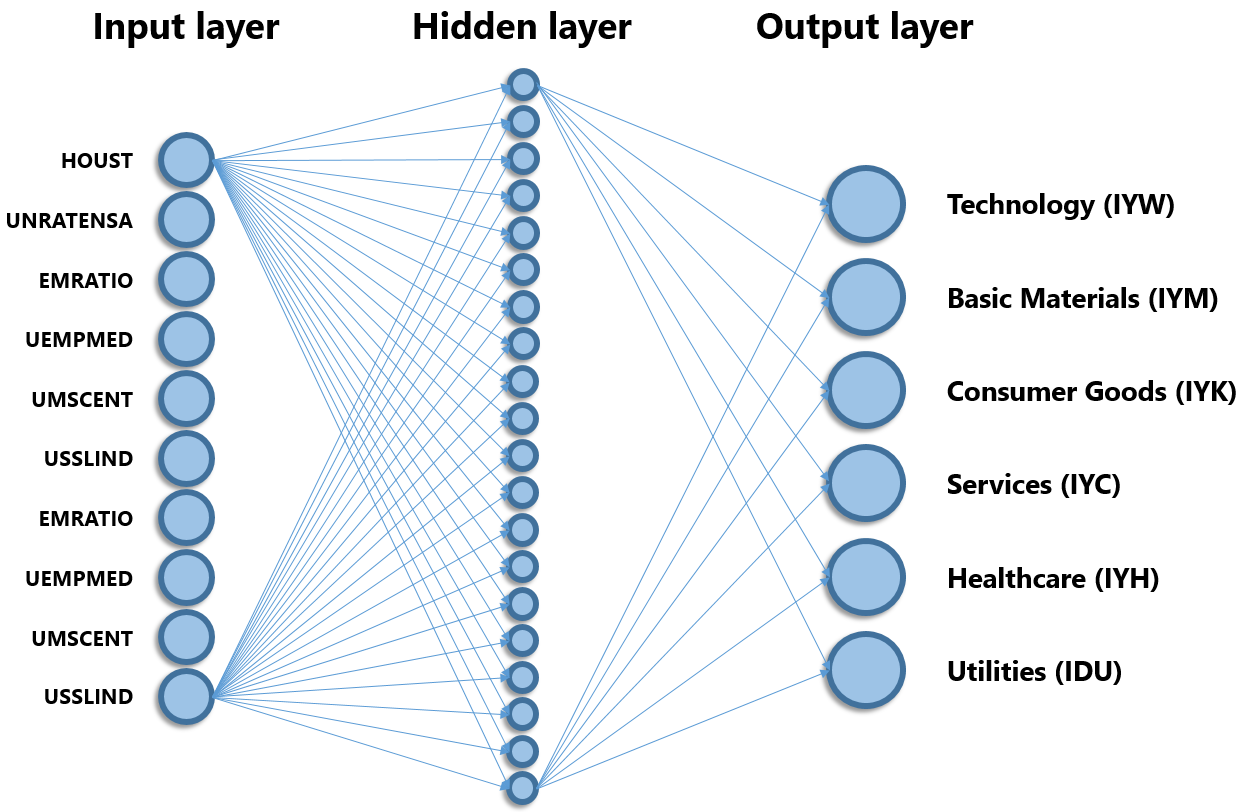
Figure 3 shows a simplified diagram of the NN model. The model has a single hidden layer. The input layer contains 10 neurons corresponding to the 10 economic indicators. The hidden layer contains 20 neurons and output layer 6. The NN is fully connected which means that every neuron in a given layer is connected to every neuron in the next layer. This is depicted with two neurons in each layer: the remaining connections are omitted for clarity. The model is thus designed to take in values of 10 indicators for a given week, and predict the values of the 6 sector ETFs for the same week.
Results
Figure 4 | Predicted vs Actual Values
Figure 4 shows the output of the model for the Technology sector ETF. The blue line is the actual price data for the ETF while the orange line shows the model’s prediction. Up until the green region, the orange line corresponds to the model’s predictions on the training data. Recall that the model is generating the ETF prices based on economic indicator values.
The cross-validation data is highlighted in green and begins on September 23rd, 2016. The model does not see economic indicator values in this region during training. Once trained, the model is then given these unseen indicator values and outputs what it thinks the ETF price should be. At first glance, the predicted price line seems to follow the general trend of the actual data. Around March 2017 the model begins to overshoot and then seems to not follow the upward trend thereafter. However the results seem promising for a simple model without optimization! Expand the list below for the other 5 ETF prediction plots.
Remaining 5 sector ETF predictions.
Figure 5 | Learning Curves
To visualize the accuracy of the model, a learning curve plots the root mean square error (RMSE) vs training iteration or epoch. As the model learns to fit the training data, the training RMSE is reduced. Consequently, the model is able to better predict ETF prices in the CV data set and the CV RMSE is also reduced. Learning curves can signal overfitting which occurs when the training data is fit so well by an overly complex regression, that the model cannot generalize well to unseen data. This would be marked by a an inflection point where the CV RMSE begins to rise as the training error continues to decrease. In my case however, both the training and CV error continue to decrease with training iteration. Increasing the number of training epochs can thus continue to improve the model’s accuracy.
Figure 6 | Predicted vs Actual Values - TRAINING
We can get a visual representation of the model’s accuracy by plotting the predicted values against the actual values for all ETFs. Figure 6 shows this for the training dataset. Training data is normalized when fed into the model and thus ranges between 0 and 1. The orange line has a slope of one and shows where all the points would lie if the model was perfectly accurate. Notice that some of the predicted values go negative at the lower end and above one at the higher end. The model’s accuracy may therefore be improved by simply putting fixed limits at 0 and 1 on the model’s predictions. Also, more points seem to fall below the orange line at higher actual values, indicating the model tends to under predict at higher prices.
Figure 7 | Predicted vs Actual Values - CV
Figure 7 shows the same type of plot for the CV dataset. The predictions appear to be spread further from the ideal line. This is expected since we see in the learning curves that the CV RMSE is always higher than the training RMSE.
Figure 8 | Technology ETF vs Indicators
Ultimately I want to know whether economic indicators are good predictors of sector ETF prices. This is an important question to answer before devoting time and resources into model optimization. Since the NN model is performing a regression on the ETF prices vs economic indicators, the model’s accuracy should depend on how well the two variables are correlated. The relationship between the two need not be linear, but there should be good correlation. Figure 8 shows the Technology ETF price vs the housing starts indicator (HOUST). There is a general trend where the Technology ETF rises in price as housing starts increase. However imagine trying to fit a curve to this data: it would be difficult because for some HOUST values, there seem to be many equally valid prices. For example, imagine trying to predict the Technology ETF price when housing starts are between 890 and 900 for a given week, what price should one choose?
Remaining 9 indicator dependence plots.
Table 2 | Sector ETF & Economic Indicator Correlations
| Technology (IYW) | Basic Materials (IYM) | Consumer Goods (IYK) | Services (IYC) | Healthcare (IYH) | Utilities (IDU) | |
|---|---|---|---|---|---|---|
| HOUST | 0.549 | 0.132 | 0.599 | 0.587 | 0.531 | 0.566 |
| UNRATENSA | -0.703 | -0.217 | -0.771 | -0.722 | -0.658 | -0.707 |
| EMRATIO | 0.677 | 0.198 | 0.737 | 0.694 | 0.649 | 0.692 |
| UEMPMED | -0.693 | -0.203 | -0.763 | -0.73 | -0.68 | -0.682 |
| UMCSENT | 0.555 | 0.182 | 0.553 | 0.57 | 0.631 | 0.549 |
| USSLIND | 0.105 | 0.157 | 0.112 | 0.096 | 0.14 | 0.175 |
| KCFSI | 0.178 | -0.279 | 0.245 | 0.194 | 0.093 | 0.247 |
| IPMAN | 0.697 | 0.22 | 0.737 | 0.713 | 0.659 | 0.698 |
| VIXCLS | -0.057 | -0.313 | -0.018 | -0.043 | -0.027 | 0.013 |
| DGS10 | -0.149 | 0.214 | -0.23 | -0.165 | -0.127 | -0.319 |
| Mean Correlation | 0.436 | 0.211 | 0.477 | 0.451 | 0.42 | 0.465 |
| RMSE | 1.196 | 2.064 | 1.04 | 0.962 | 0.92 | 1.072 |
Mathematically, we can test for how well the ETFs are correlated to the economic indicators using the Kendall correlation coefficient. This is a common technique for correlating non-parametric variables. Table 2 shows the kendall correlation coefficients for each ETF to the 10 economic indicators. Perfect correlations would correspond to values of 1 or -1. The highest correlation in this dataset is between Consumer Goods and Median Duration of Unemployment (UEMPMED), while the lowest correlation is between Utilities and CBOE Volatility Index: NSA (VIXCLS). These cells are highlighted green and red, respectively. It’s clear there is a wide variability in how well sector ETF prices are correlated to economic indicators.
The mean correlation is the mean of the absolute values of the correlation coefficients. This gives us an idea of the average correlation of an ETF to the 10 economic indicators. We can compare the mean correlations to the RMSE for each ETF. The correlation is not exactly 1 to 1 where the higher the correlation the lower the RMSE, but there is a strong dependence. Basic Materials has about half the mean correlation of the other ETFs and double the RMSE. Services and Healthcare which have 2 out of the 3 highest correlations, also have the lowest RMSE values. From this we can conclude that not all economic indicators are useful predictors of sector ETF prices. CBOE Volatility Index: NSA (VIXCLS) for example has poor correlation to all 6 sector ETFs. Before proceeding to optimize the NN model, it would be worthwhile to explore additional economic indicators and use ones with high correlation to the ETFs of interest. This would give us a better chance of making an accurate forecast model.
Summary
A simple neural network with a single hidden layer was used to predict U.S. Sector ETF prices using 10 economic indicators. The model seems to capture general trends of the ETFs. A look at correlations between ETF prices and economic indicators shows that not all economic indicators are useful in predicting sector ETF prices. Further exploration of other economic indicators with high correlation to ETF prices is recommended to achieve a more accurate prediction model.


Leave a Comment